A new appearance for Moodle
Moodle has now a sleeker, cleaner and more accessible appearance with a new theme. While it features the same 3-column layout with the navigation on the left, the content column in the middle and the blocks on the right, you now have a wider space in the middle for your content. The navigation on the left can be toggled on and off, which gives you even more space to work on your course.
Course administration has moved

Within your course, you will notice that the Administration block has disappeared from the bottom-left hand corner. That’s because it has moved to the top-right hand corner, under the Settings icon . Click More… for more course administration options that may be hidden.

The Settings icon will also display different options depending on the activity you are viewing.
Turn editing on has moved

Turn editing on is now accessible only via Course Administration. Click the Settings icon from the top-right hand corner to enable editing mode.
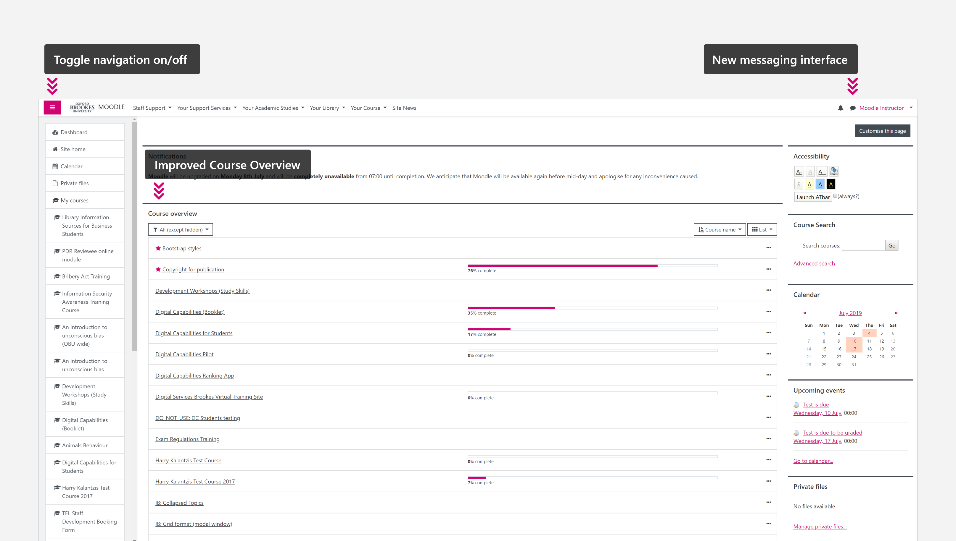
Toggle the navigation on/off

If you need more space to work on the course in the middle, you can toggle the navigation bar off, which makes the middle column even wider. Click the white hamburger icon on pink background from the top-left hand corner to toggle navigation on and off.
Blocks can no longer be docked

Previously you were able to remove blocks from your Dashboard and course pages by temporarily docking them to the left-hand side, which is no longer possible. Also blocks can only be placed on the right-hand side.
Mobile-friendly look
As before, the new theme adapts to the screen of the device you are accessing Moodle from, which creates a more consistent look on your tablet or phone.