Choosing the correct colours for your documents, presentations, Moodle courses and websites is crucial as one of the key regulations associated with Digital Accessibility is to maintain an appropriately high colour contrast between the foreground (text) and background. By using the correct combinations of colours in the Brookes branded colour palette you can ensure that your resources remain digitally accessible to all.
Basic rules when using colour for digital resources
- Use light text on dark backgrounds and dark text on light backgrounds.
- Keep it simple. Use colour sparingly.
- Colour will enhance the reading experience for a few, be neutral for most and can adversely affect many.
- If you are signalling emphasis, do not use colour alone.
- Screen readers generally recognise bold and italics.
- Screen readers adjust the voice and give verbal cues to indicate emphasis.
- Screen readers do not recognise colour change as an indicator of emphasis.
- Avoid highlighting for emphasis.
- Highlighting is widely used to dynamically indicate editorial suggestions in feedback.
- Outside of this, highlighting reduces legibility by reducing contrast or causing interference.
- Reversed-out highlighting, where a dark highlight is used over white text is even harder to read.
Using digitally accessible colours
To check the colour contrast of any colour combination, use WebAim’s Colour Contrast Checker. Remember the foreground colour is the text and the background colour should be the whole of the colour behind the text.
Recommended colour combinations
There are other colours and colour combinations that are used on the Brookes website, on Brookes branded merchandise and marketing, and in certain faculties. Please note that not all colours on the ‘Our colours’ page in corporate identity are appropriate for digital resources. These colours are instead those that represent the Brookes brand across all physical and digital resources.
Text colours to use on Light Backgrounds (White or Light Grey)
- OXFORD BROOKES CHARCOAL
- C71 M56 Y47 K44
- #424A52
- RGB(66, 74, 82)
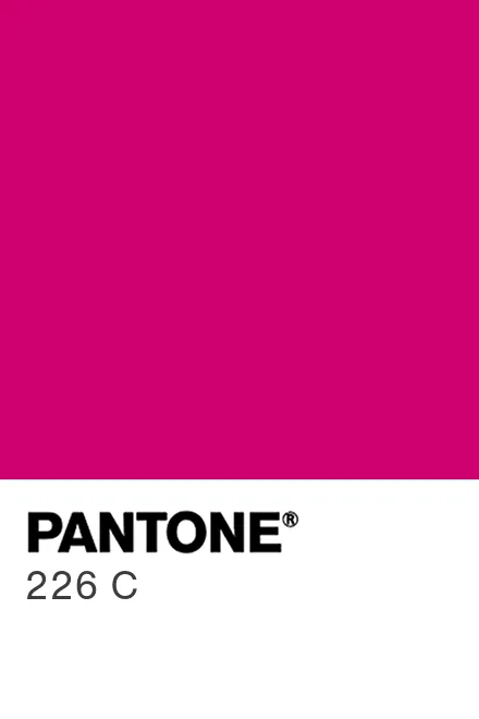
- OXFORD BROOKES PINK
- C2 M94 Y2 K0
- #D10373
- RGB(209, 3, 115)
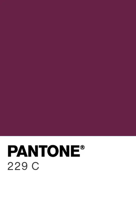
- OXFORD BROOKES PURPLE
- C229 M100 Y25 K15
- #6A2150
- RGB(106,33,80)
- OXFORD BROOKES BLUE
- C92 M62 Y0 K0
- #115da9
- RGB(29,94,169)
- OXFORD BROOKES GREEN
- C95 M10 Y85 K30
- #006338
- RGB(0,99,56)


Text colours to use on Dark Backgrounds (Charcoal Grey)
Best option is White: C0 M0 Y0 K0; #FFFFF; RGB(255,255,255)
Other options include the 10% shade of the above colours:
- Brookes Pink 10%
- #FAE5F1
- RGB(250,229,241)
- Brookes Purple 10%
- #F0E9EE
- RGB(240,233,238)
- Brookes Blue 10%
- #E7EEF6
- RGB(231,235,244)
- Brookes Green 10%
- #E7EFEC
- RGB(231,239,236)
Please note, if you are using the Oxford Brookes Business School branded colour Blue as a background you can use the same suggestions as above for the Text colour.
How to change the colour of the text and background
Microsoft Office
- Changing the colour of text in Word
- Changing the background colour/page colour in Word
- Changing the colour of text in PowerPoint
- Changing the background colour of slides in PowerPoint